CASE STUDY
Information Architecture and Website Design for a Popular Podcast
THE RESULTS
Organization of 200+ podcast episodes by category for easy user navigation
Optimized book & merchandise sales through categorization
Highlighted sponsors by category so listeners can easily browse and access what they need which in turn gives the podcast more advertisers
Created icons inspired by existing visual identity
Extensive custom css for both form and function
Integrated patreon and Shopify site into Squarespace site
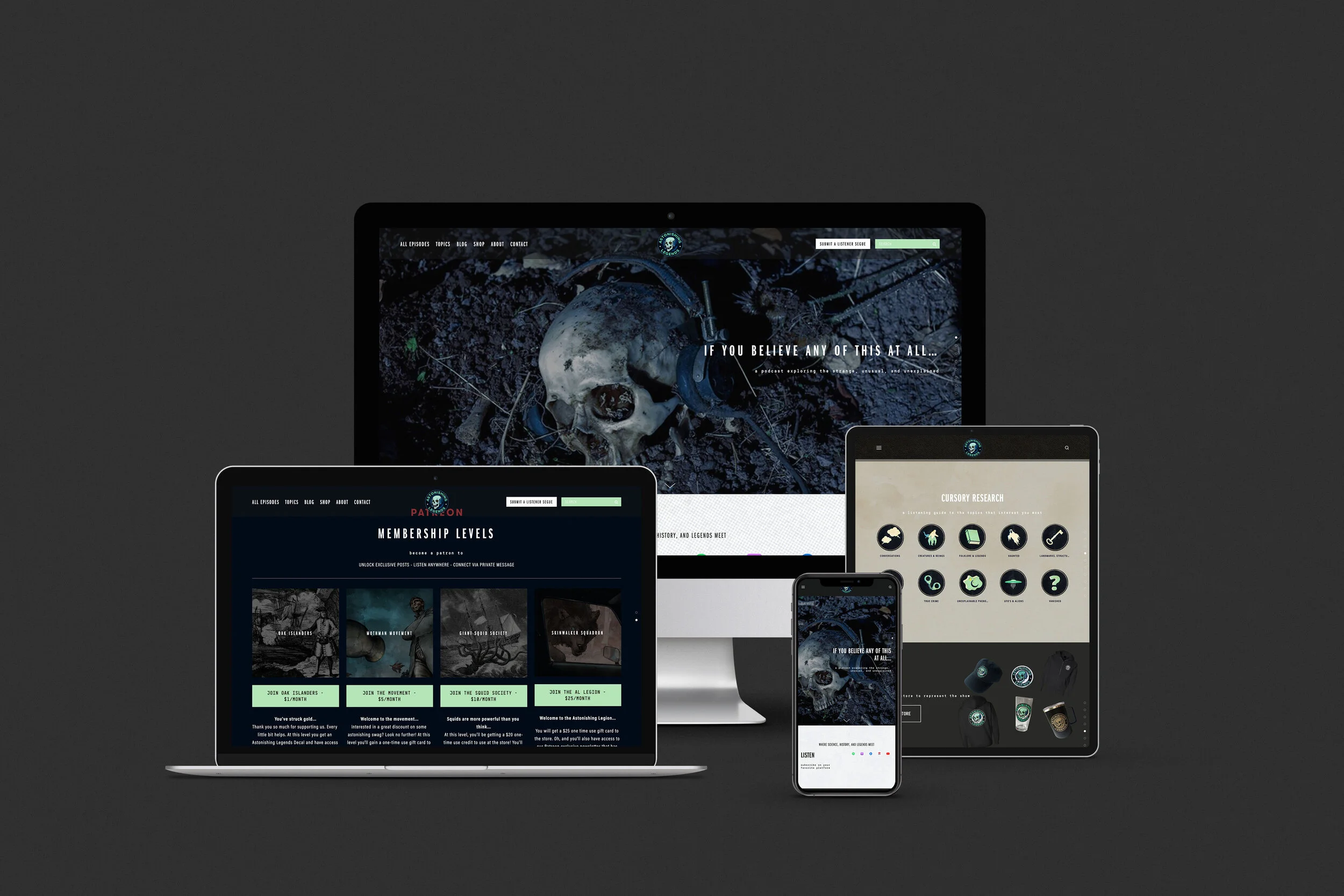
site is responsive to all devices
custom UI elements
categorization of topics in navigation - CSS edits to navigation to for single page navigation. Users can browse or skip to exactly what they want
UX/UI Challenges
3 different personas using the site and each would be navigating the site with varied levels of interest in the podcast and topics
An existing logo but no additional assets - fonts, additional icons, and color scheme need to be defined
Long-term organization of podcast episodes, blog entries, and book suggestions that cross reference each other to maximize user engagement
Organization system of sponsors to optimize profits
The original site had a lot of links that bounced users off the site to another platform - the ultimate goal is to keep users on the site as long as possible and only use external links when absolutely necessary
Key Feature Goals
Accessible and inviting to all - should not feel like an exclusive club
Optimize passive income - cross reference books, merch, patreon, and sponsors as much as possible
Simple organization system that the team can use long-term
Personas and how they explore info
Solutions
Personas
The podcast serves people who are newly interested in the topics they discuss as well as people who are using the podcast as research or a resource. We wanted to keep the site accessible to both and allow users to choose their topic of interest. If they are a new user we wanted to avoid feeling overwhelmed by too many episodes and giving up. For users already interested in the topic and researching having categorized topics allows them to get exactly where they want to be and listen to topics in bulk. For long-term listeners having the additional option to sort episodes by release date offered a quick reference on the site for all episodes.
Organization System
With all of the topics we needed a system that eliminated repetitive tasks and optimized passive income. After sorting through all 200+ episodes we were able to break everything down into 10 main categories. Each category could then have additional tags added for further breakdown when needed. This allows users to view options broadly and super specific. These categories and tags are universal throughout the site for books, blogs and episodes. This system eliminated at least 3 steps when uploading new content saving the client time and money.
Navigation
Navigating topics is available via text links in the header nav as well as visually through icons and brand imagery. Additionally there is a side screen navigation to easily switch topics when in the middle of a page. Most pages are set up as index pages, users can jump to a spot on it when clicking a link or scroll everything at once. All of this is done via CSS
Integrations
The original site had too many links bouncing users off which affected their SEO. In this redesign we were able to integrate their Shopify store so users never leave AstonishingLegends.com as well as populate nearly all of the Patreon information, users only would leave the site to pay. Whereas previously it would go to a patron page. Amazon Affiliate links were also streamlined using features already within Squarespace.
side screen navigation
Patreon page within site - keeps users on site and brand identity consistent
Navigation breakdown
Archived Episode page - allows users to view by year by jumping down on page or scrolling with CSS
UI Design
When I began working on the site the logo was the only asset provided, additionally there were multiple iterations of it and an overall mood had not been decided on. One iteration of the logo had grunge effects that reflected the mood of the podcast perfectly while the other was a clean cut graphic. Ultimately we combined the best of both worlds. The clean cut logo was used and I added in the flaming eyes GIF for an additional something special touch. I designed all of the icons for each category using the grunge effect and used that effect throughout the site for banners and backgrounds.
Lastly, the fonts needed to be chosen as well keeping with the modern and grunge combo a typewriter font face with a bold sans serif were chosen to blend together and tie everything together.
example of all fonts in use with background
merch banner
Grunge banner


